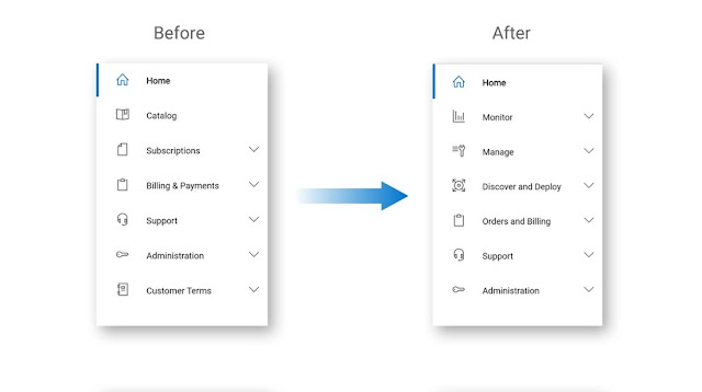
After all the exciting Dell APEX expansion announcements we recently shared on the Dell Technologies World stage, an update for the Dell APEX Console has set sail! Our product and design team has developed a refreshed interface to enhance ease of use after listening to you – our users – and taking notes. The next time you log in to the Dell APEX Console, you may notice an adjustment to the order and naming of navigation elements. These research-backed updates improve findability, match terminology expectations and consolidate related tasks and activities, making it easier for you to quickly find what you need and complete your task at hand. Our design goal is to anticipate the outcomes you need and provide you with a flat and clean, two-level navigation structure to get you there intuitively.
New Dell APEX Console Features
At Dell, we share a continued commitment to realizing your multicloud journey through simplicity, agility and control. We’re focused on delivering a transformational Dell APEX user experience. To do so, we’re immersed in qualitative and quantitative research studies, customer interviews and focus groups. This insight helps us better understand user needs and iterate on the console experience accordingly. We’ve made several navigation changes to make it easier to complete certain tasks based on usability feedback, testing and validation.
Highlights of the Dell APEX Console navigation changes include:
◉ Catalog renamed to Discover and Deploy
◉ Subscriptions now under Manage
◉ Billing and payments renamed to Orders and Billing
◉ New menu item: Monitor
Users like that our new navigation has:
◉ Clean and organized structure
◉ Direct navigation with less clicks to get to what they want
◉ Everything in one place
◉ Ease of use
Dell APEX Console Left Hand Navigation
How it’s Realized
Here’s how we put business objectives at the forefront of how we organize our tools and menu to streamline the user experience for our customers. For example:
◉ Discover and deploy. All things related to configuring and deploying services have now been streamlined under the Discover and Deploy tab. Here, administrators can learn all they need to know about APEX cloud and infrastructure services. Configure the offer that best meets your specific use case and business needs.
◉ Manage. Once an order has been placed, the manage tab makes it easy to view the status of services, manage sites and track delivery around the world to the site of your choice. Save your site requirements to streamline future orders and reduce the risk of user error.
◉ The Orders and Billing tab gives financial users within your organization the power to view and approve invoices quickly for their key stakeholders. With this menu change, related actions are grouped together, meeting the needs of both the cloud administrator and the CFO team.
◉ Monitor. Our customers have told us that one of the most important aspects of ongoing cloud management is monitoring deployed services, so we’ve centralized all our monitoring tools under one tab at the top of our navigation to make it easier for our end users to quickly gain a snapshot of their environment and report out to their key stakeholders on the metrics they care about most.
Source: dell.com


0 comments:
Post a Comment