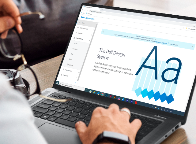
Whether customers are buying a single personal PC or upgrading to storage-as-a-service across their IT organization, a modern, clean digital design, consistent look and feel and easy navigation are essential to how they feel about the experience, the product and your company. At Dell Digital, Dell’s IT organization, we are in the middle of an evolution to better connect our products to the humans who use them.
Our effort began with a simple mandate—unify our digital experience ecosystem and reduce confusion for our customers.
Like many longstanding companies, Dell has grown and matured its business over the years from being primarily a hardware company that allowed great customization and flexibility to a leader in software services and infrastructure. Because of that, we have thousands of digital experiences out there across different URLs and domains that we own as a company which do not reflect who we are today.
We started by building a modern design practice that would standardize our digital experience—the look and feel, basic interaction patterns, palette and colors that reflect our brand. Our efforts to institutionalize our design have led to a broader mission that is still underway to create a unified customer experience across Dell.
Three years into the process, we’ve built a design system that is reusable, measurable and delightful. We’ve increased customer engagement and improved our navigation structure. We’ve baked accessibility into our design system and are working to integrate it seamlessly into our developer experience. Our customer satisfaction (CSAT) reached an all-time high across all experiences. And our transformation is continuing.
First part of the puzzle
We initiated the process by focusing on evolving our design language system, which contains the core design and code components that our company uses to build our digital experiences. Dell had a nascent design system in place which provided a foundation. We built a new platform, the Dell Design System, on Dell products and using a complete Dell infrastructure and latest technologies to host an evolved experience.
The Dell Design System is the first part of the puzzle toward creating a unified customer journey but it’s not the whole puzzle. It defines key digital elements, like buttons, modal windows, carousels, page headers and footers. It also standardizes topography and font for consistency.
Those components make up the larger patterns for our digital ecosystem. Designers and engineers can access the components via a repository of code and design elements that also support UI and dev kits at delldesignsystem.com. They can also use micro front ends (MFEs), webpage components, building blocks that can be plugged into a page, or unplugged, to quickly construct the consistent look and feel for the customer experiences we want. MFEs use the Dell Design System and are stored in a UX marketplace.
An important part of the Dell Design System is its focus on inclusive design to ensure we are building products for people of all abilities using the World Wide Web Consortium international guidelines. We have an accessibility team review all components before they are added to the design system for compliance. I’ll talk more about this in a future blog post.
Among the reasons for institutionalizing design systems is the need to tackle common software development challenges. With standardized, repeatable code, developers and engineers don’t have to reinvent the wheel every time they need to include a common feature. After all, nobody needs to create the same three address fields over and over. Using our design system, developers can build best-in-class, consistent designs like mastheads and footers fast. They can turn Dell blue to Dell purple in an instant.
The Design System not only creates consistency, but it also accelerates time-to-market. We are all aligned in a beautiful, consistent experience.
And, of course, a single design system means we can give the many sites across the company a unified, recognizable look and feel and a more user-friendly, modern design. We are transforming the aging experiences that don’t reflect the current impetus of the company or provide the information that customers are coming to find into those that do.
Dell has always had great industrial designers, as reflected in our products. We are now extending that excellence to our digital spaces.
We launched the first generation of our design language system two years ago, focusing on how to put the building blocks together. We then started to evolve it to define where we want to go for our recently launched second generation and beyond.
Because the Design System reflects what’s happening in the products themselves, we work closely with product teams to meet their needs. It’s a true collaboration model that encourages users to contribute back into it.
Among the challenges we face is how to achieve commonality in a company that uses multiple solutions across multiple platforms. One way is to provide generic versions of the cascading style sheets and JavaScript. Another is by building kits for developers and designers to help them implement this into the actual applications they use to either code or design.


0 comments:
Post a Comment